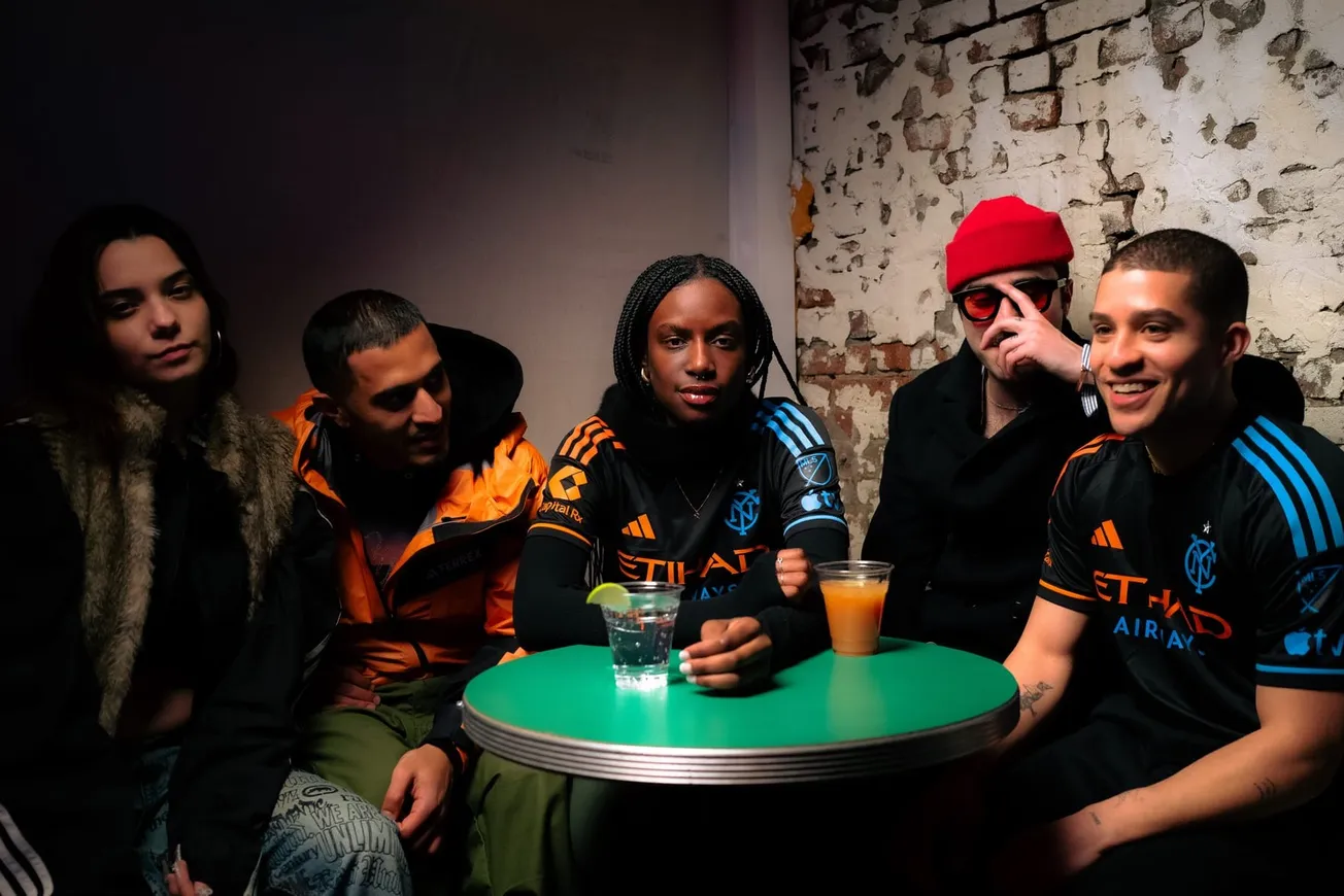
Every time an expansion club comes into Major League Soccer, all eyes turn to their impending logo and kit. These visual aids are vitally important to a new team in any sport, particularly as a physical embodiment of a club’s identity. Although every player can define themselves with their individual boots, a club is defined by its common kit.
NYCFC, in its three years, has worn a total of six kits; five of which can be considered regular. While our expansion brother club Orlando City SC has kept both their home and away kit relatively simple, NYCFC has diverged at bit. Our away kit shifted drastically from 2015 to 2016 (which is still worn now), while our home ensemble has only gone through slight changes — particularly the 2017 shift to navy shorts, as well as the addition of both a monogrammed New York City flag along with an accented collar and sleeves.
While some of these kits have helped define the club’s unique identity, others have simply copied Manchester City — further feeding into the “little brother” perception.
Without further ado, here is a definitive ranking of every kit NYCFC has ever worn on the pitch.
1) 2015 Away
:no_upscale()/cdn.vox-cdn.com/uploads/chorus_asset/file/8416695/usa_today_8681131.jpg)
Before jumping down my throat, hear me out. As a club whose founding was directly tied to Manchester City and City Football Group as a whole, part of our challenge was defining our identity. Our 2015 Away kit — which we most certainly did not wear enough — accomplished this goal. Not only did it somewhat separate us from Manchester City’s light blue and white, but it separated us from nearly every other New York sports team.
The Yankees? White pinstripes at home and navy blue on the road. The Knicks? Blue at home and white on the road. The Giants? Blue at home, white on the road, and maybe a red alternate if your lucky. I’m assuming you get the picture. In recent years, no long-standing New York City sports team opted to wear uniforms mixing black with a non-white color. Sure, the Brooklyn Nets wear black on white (and vice-versa), but we all know that those jerseys are painfully boring. NYCFC, by placing a bright blue trim on a black kit, deviated from the New York norm, eschewing tradition in favor of establishing itself as the new club on the scene.
Black is a vicious color. Combining it with blue not only established our identity but set us apart from the New York of old. Outside of the identity this kit established, it’s also objectively awesome. I mean c’mon, black with light blue trim? Pure class. It’s a shame the club only spurred these all-blacks after one season.
2) 2017 Earth Day Alternates
:no_upscale()/cdn.vox-cdn.com/uploads/chorus_asset/file/8416697/042017_Parley_Photos_8.jpg)
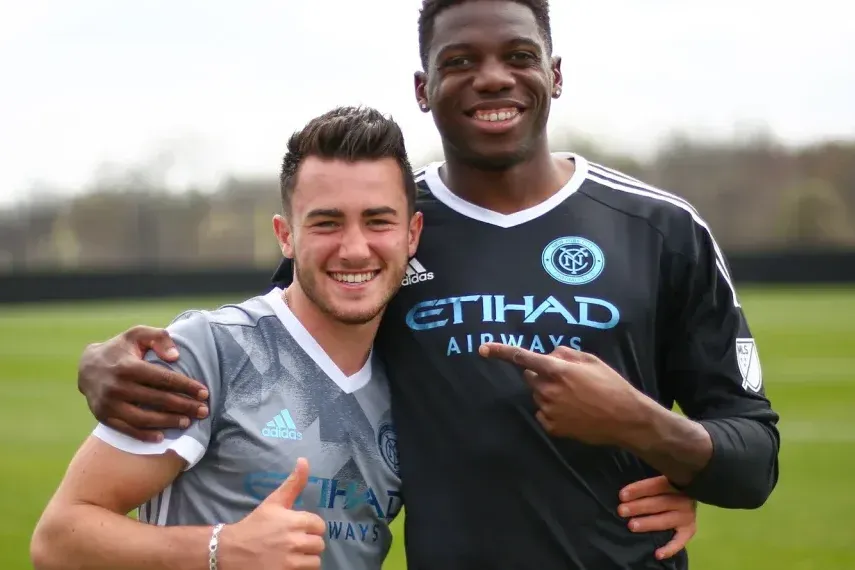
Damn. These kits are nothing short of a masterpiece. Had these ever been chosen as a regular kit, they’d be first on this list. Although Adidas collaborated with Parley for the Oceans to design these kits for a few clubs, they undoubtedly fit NYCFC the best. NYCFC’s light blue is a strong color — particularly when its used secondarily as an accent on a black or grey primary shirt. While the all-blue kit reminds us of Manchester City, the light blue on grey simultaneously reminds us of both our New York nature and our status as a fresh face on the MLS scene.
On top of all of this, the fact that these kits are made out of recycled ocean-sourced plastics puts the icing on the cake. Environmentalism and swagged out kits? Sign me up. Unfortunately, like most good things in my life, these kits are unattainable, unless you can afford to buy one at auction — currently hovering around $14,000.
3) 2017 Home
:no_upscale()/cdn.vox-cdn.com/uploads/chorus_asset/file/8416731/usa_today_9963310.jpg)
After two years of plain, Manchester City-like blue kits, we finally changed things up a bit. Here, the famous Etihad kit finally got a New York twist — most notably in the form of a monogrammed New York City flag, along with an accented collar and sleeves. The inclusion of navy blue shorts only further separated us from our British forefathers. While the light blue Etihad kit will always remind us of Manchester City, this edition is likely the closest we’ll ever get to placing our own New York stamp on the British standard.
4) 2015 Home
:no_upscale()/cdn.vox-cdn.com/uploads/chorus_asset/file/8416745/usa_today_8877276.jpg)
As previously mentioned, it’s incredibly difficult to separate ourselves from Manchester City, particularly when we’re wearing the exact same kit with a different badge. Of course, the 2015 kit — like Manchester City’s blue norm — is both aesthetically pleasing and classy. For NYCFC however, the kit ultimately failed to establish a unique club identity. In 2015, in these kits, we were little more than Manchester City’s American little brother.
As Mark Yesilevskiy put it at the time of their original release, “it’s disappointing to see NYCFC stick only to Manchester City’s shades of blue and not incorporate many of the colors from the flag of New York.”
The only thing that comes close to saving this kit is the “2015 Inaugural Badge” on the front. It’s the only reason I’ve ranked 2015 ahead of 2016.
5) 2016 Home
:no_upscale()/cdn.vox-cdn.com/uploads/chorus_asset/file/8416767/usa_today_9311568.jpg)
Boring. So, so, so boring. It was almost exactly the same kit from 2015. In a meek effort to define ourselves, our socks were now blue instead of 2015’s white. Wow, socks! What a massive difference! In all seriousness, the 2016 home kit was fine. It was just a boring copycat of Manchester City, without the inaugural badge to lend it a bit of originality.
6) 2016-17 Away
:no_upscale()/cdn.vox-cdn.com/uploads/chorus_asset/file/8416753/usa_today_9578515.jpg)
I have literally no idea why these were conceived. As I’ve stated, our original away kit was AWESOME. It managed to both set us apart as a new club and define our place in New York. This kit — the infamous “hypnokit” — certainly set us apart, but for all the wrong reasons. In doing so, we also largely lost any real connection to New York.
Mike Walker, the Adidas Global Product Manager for Major League Soccer, saw it differently. In an interview with NYCFC, Walker explained “we knew it needed to be about New York and really engage the fans of each borough,” adding “it’s the epicenter of what we’re talking about.” Walker believed the kit defined “the energy and chaos of New York and that is why the lines are not perfect circles.”
Honestly, as a lifelong New Yorker, I couldn’t disagree more. New York to me has always made sense in an otherwise chaotic world. Go to D.C. or Boston and public transportation makes no sense. The organization of the city itself makes no sense. New York is an ordered grid with an easy North-South, East-West public transportation system. New York has always been artistically represented by the ordered colorful lines of the subway tracks — not chaotic expanding circles.
The Ideal Kit
The hypnokit was a failed attempt to define the club’s New Yorkness. Without knowing it, NYCFC had all the tools needed to accomplish this goal. Take our 2015 Away kit and put the New York City flag on the bottom. That kit would not only be unique, but gritty, classy, and inherently New York.

