Gotham FC released their new home and away kits earlier today. It's unusual to introduce both in the same year, but the Nike era in the NWSL begins today, and the supplier redesigned the uniforms for all 14 teams.
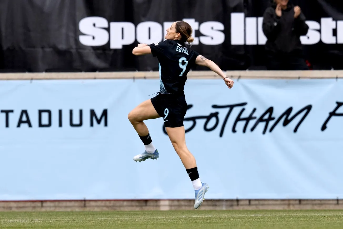
Gotham is sticking with the same-ish color schemes of recent years. Black and light teal (which they call "Gotham blue") for the first kits, just like last year. But the white away kit of last year is now a feather-light teal so delicate it's almost white.
One significant upgrade over 2023 is the star over the badge. There are aesthetic benefits to winning the NWSL Championship.
The 2024 Gotham home kit
We're a little sad to see the 2023 first kit go, to be honest. We were into the gradient stripes, the overall composition.
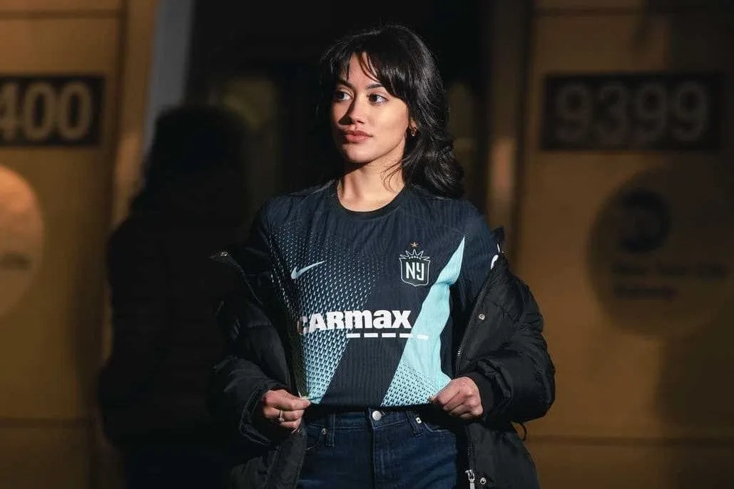
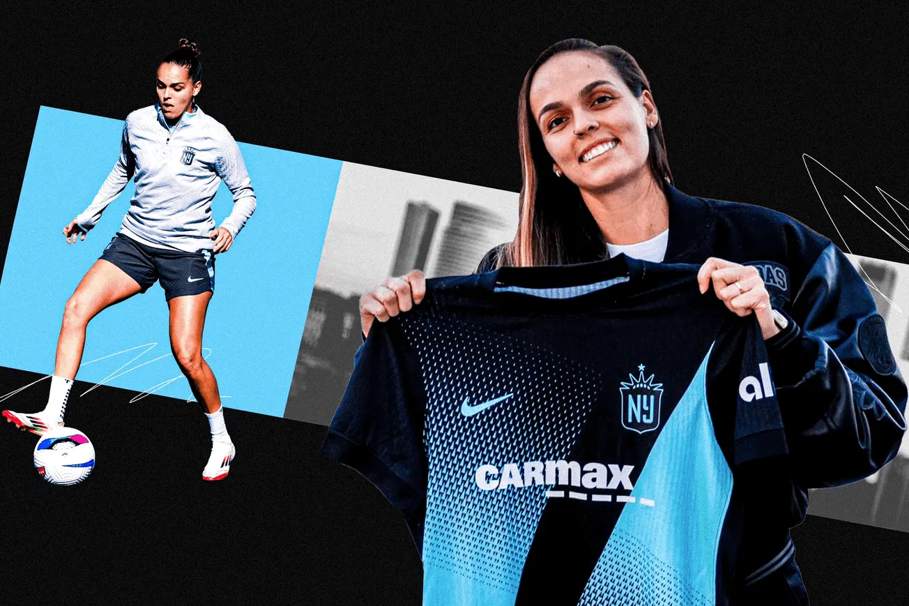
But the new Nike design brings back the sash, which is a good idea. In the past, the sash was that light teal while the shirt was black. This year, the sash is black over a gradient shirt that transitions from black to light teal. It works. The sash works like a negative space, a blackout line across the front.
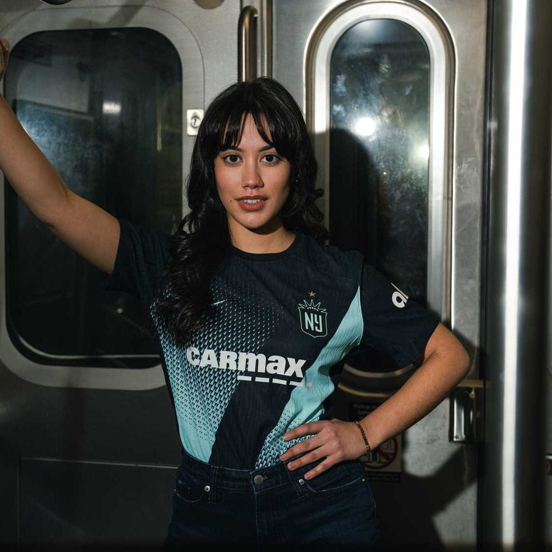
Here's what the club says about it: "The sash cuts through the two triangles, nodding to the Gotham FC’s on-field approach of tactical order and the freedom to create organized chaos.” Right on.
The home kits are available for preorder, and come in regular and narrow/curved cuts ($94.99). They're also available in youth sizes ($79.99).
The 2024 Gotham away kit
Again, we're sorry that the 2022 away kit is no more. The clean white-on-white uni was crisp and elegant — and it's the kit that took Gotham to the title as they beat the odds to win one away knockout game after another.
And again, we like the Nike take on the classic away kit. It's subtle, a lighter-than-light teal that's oh-so-close to white at the shoulders and gradually deepens as it approaches the hem. There's no patterning, but the textured fabric gives the shirt a little depth.
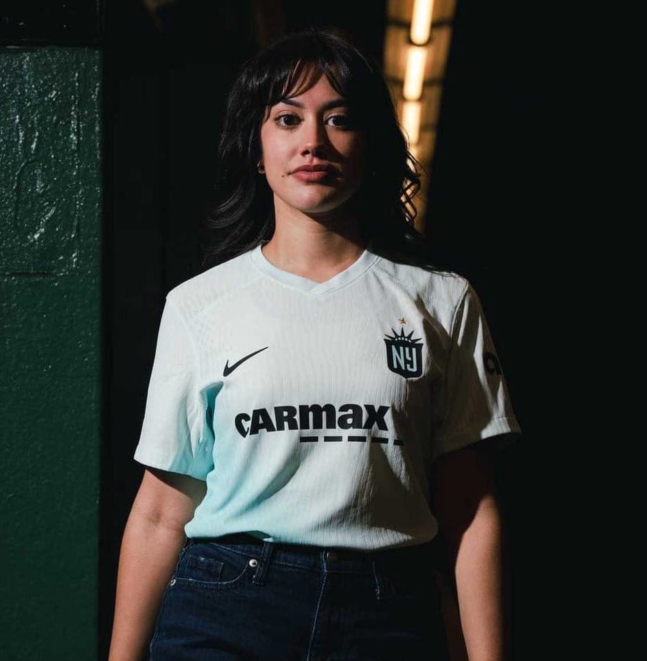
It's something you could wear on the street. The away kits are also available for preorder, and come in regular sizes ($94.99).
A final thought: Good ad campaign. We dig the public transit, the flash glare, and the whole vibe. It feels right for New York New Jersey/New York.

