
Welcome to the latest edition of the Hudson River Blue Roundtable, in which John Baney, Andrew Leigh, Matthew Mangam, and Raf Noboa y Rivera look at the 24/7 Kit that New York City FC introduced just this morning and give their fuego takes.
Hudson River Blue: Give us your initial, from-the-gut reaction to the new NYCFC away kit. Don’t hold back, unfiltered opinions only.
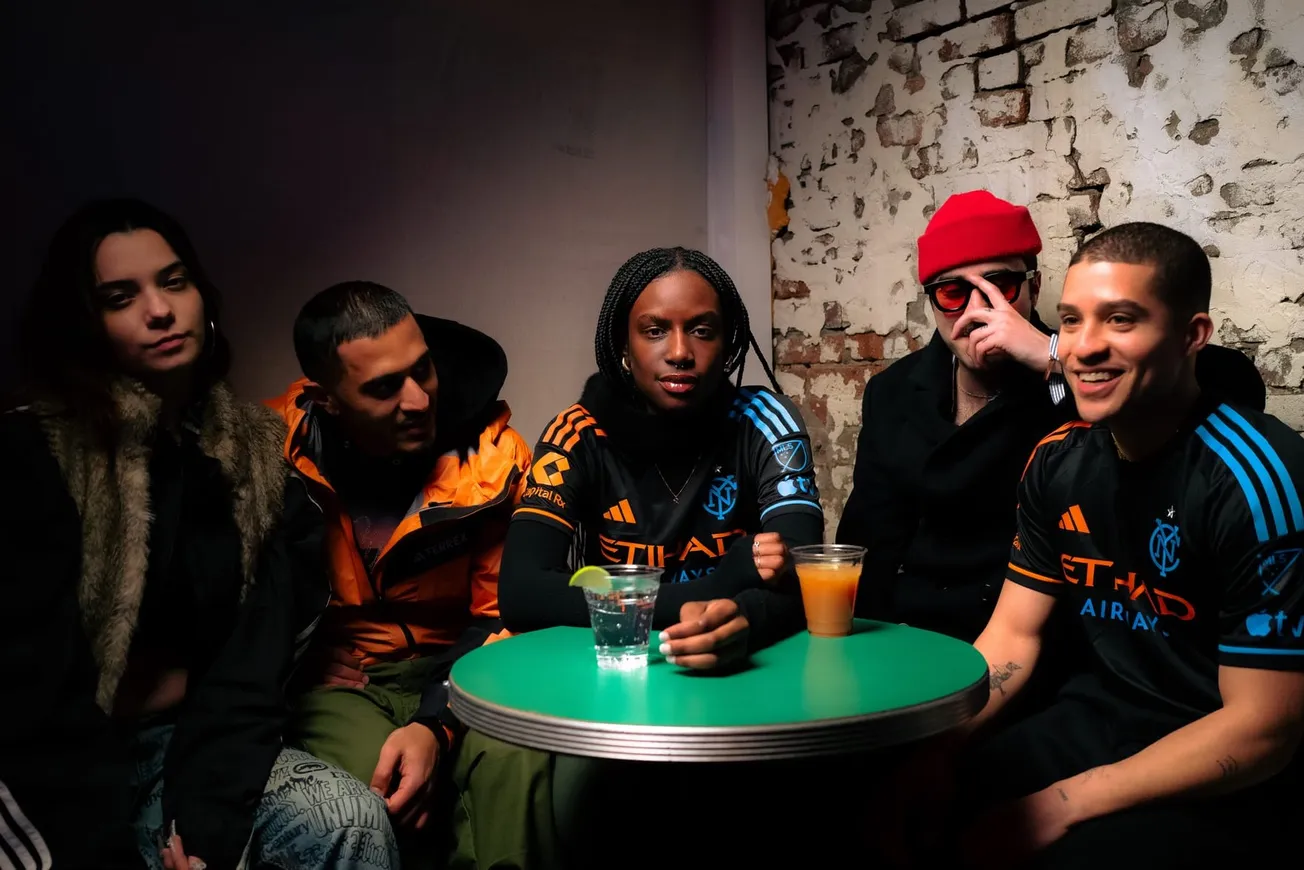
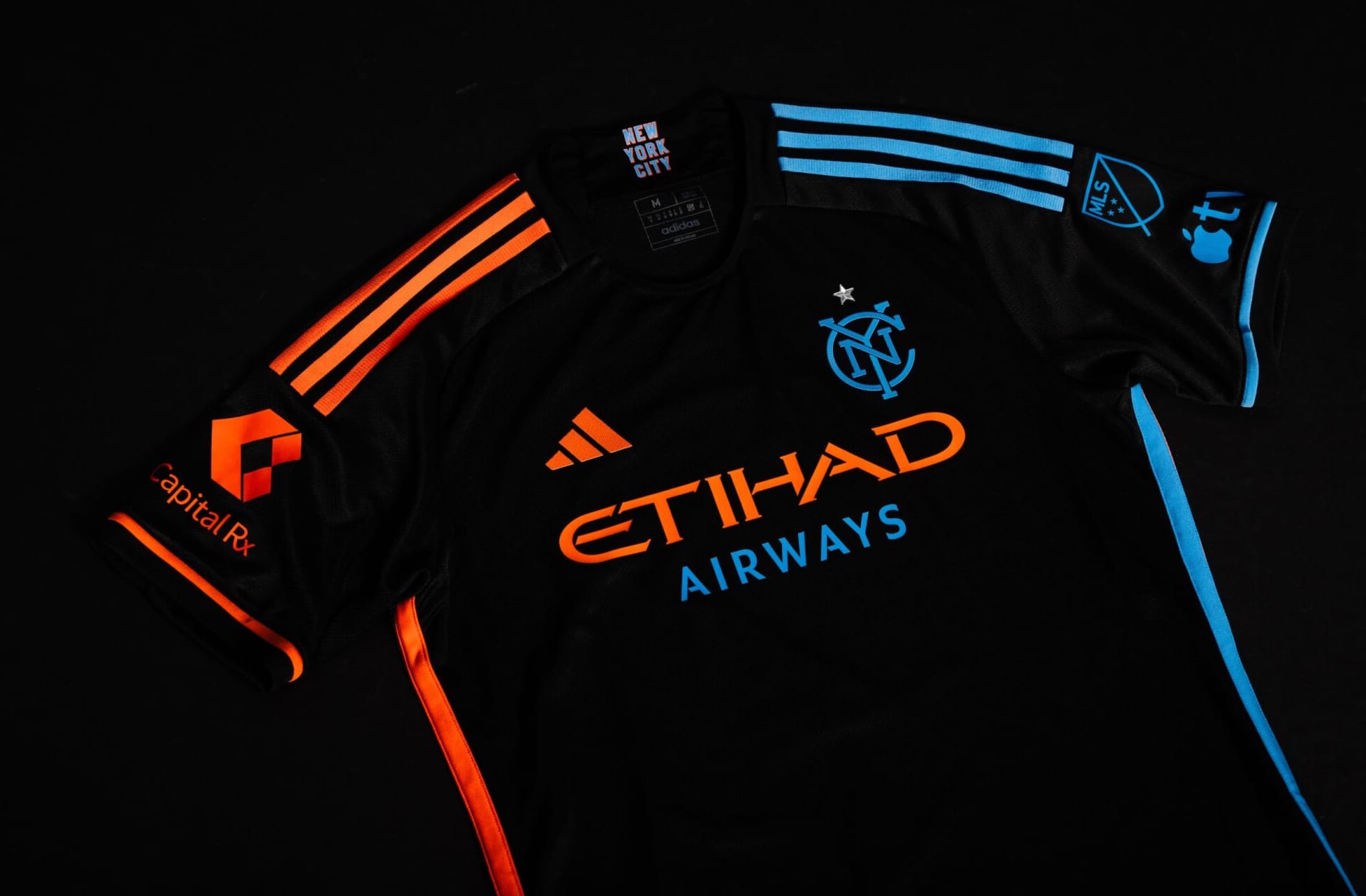
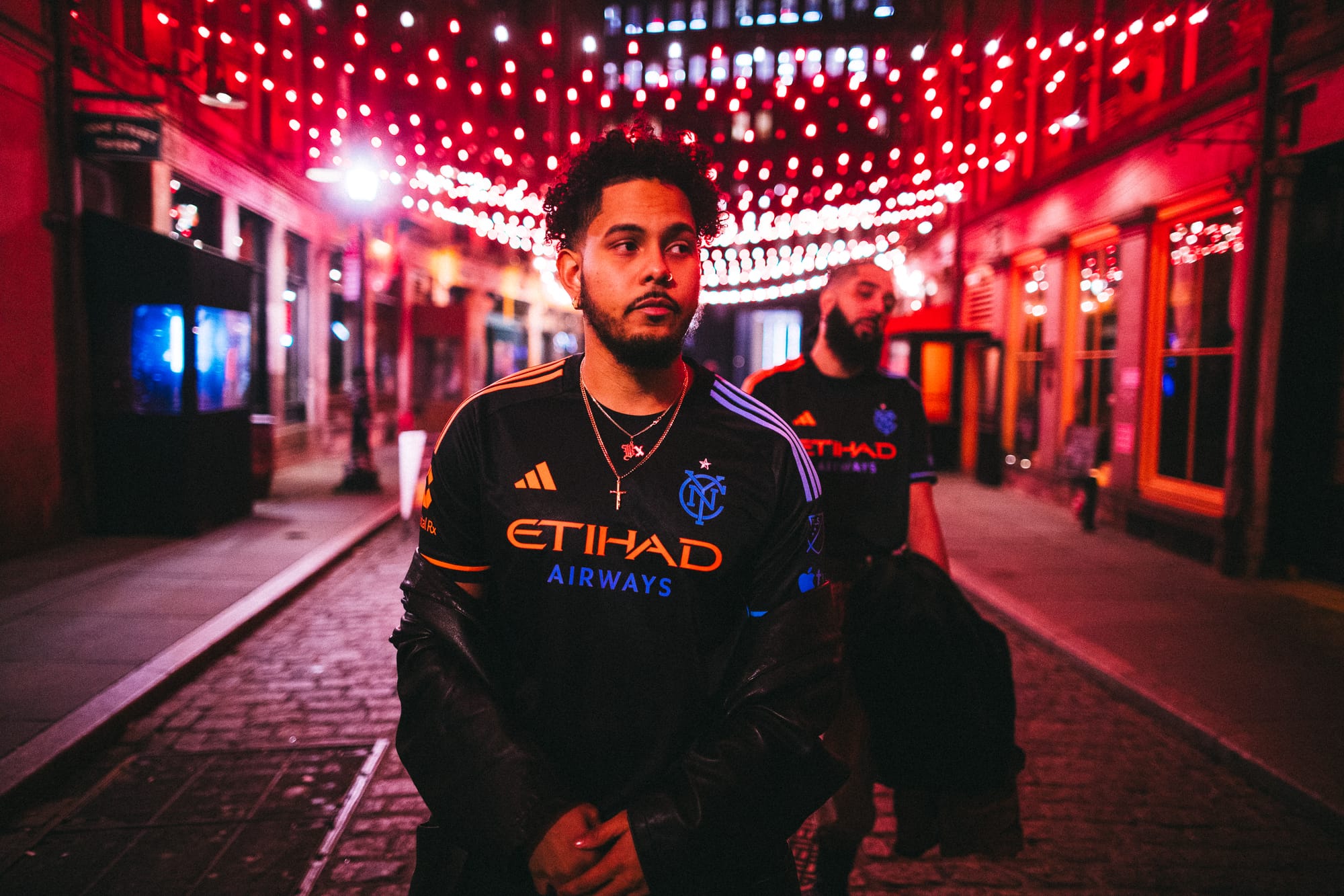
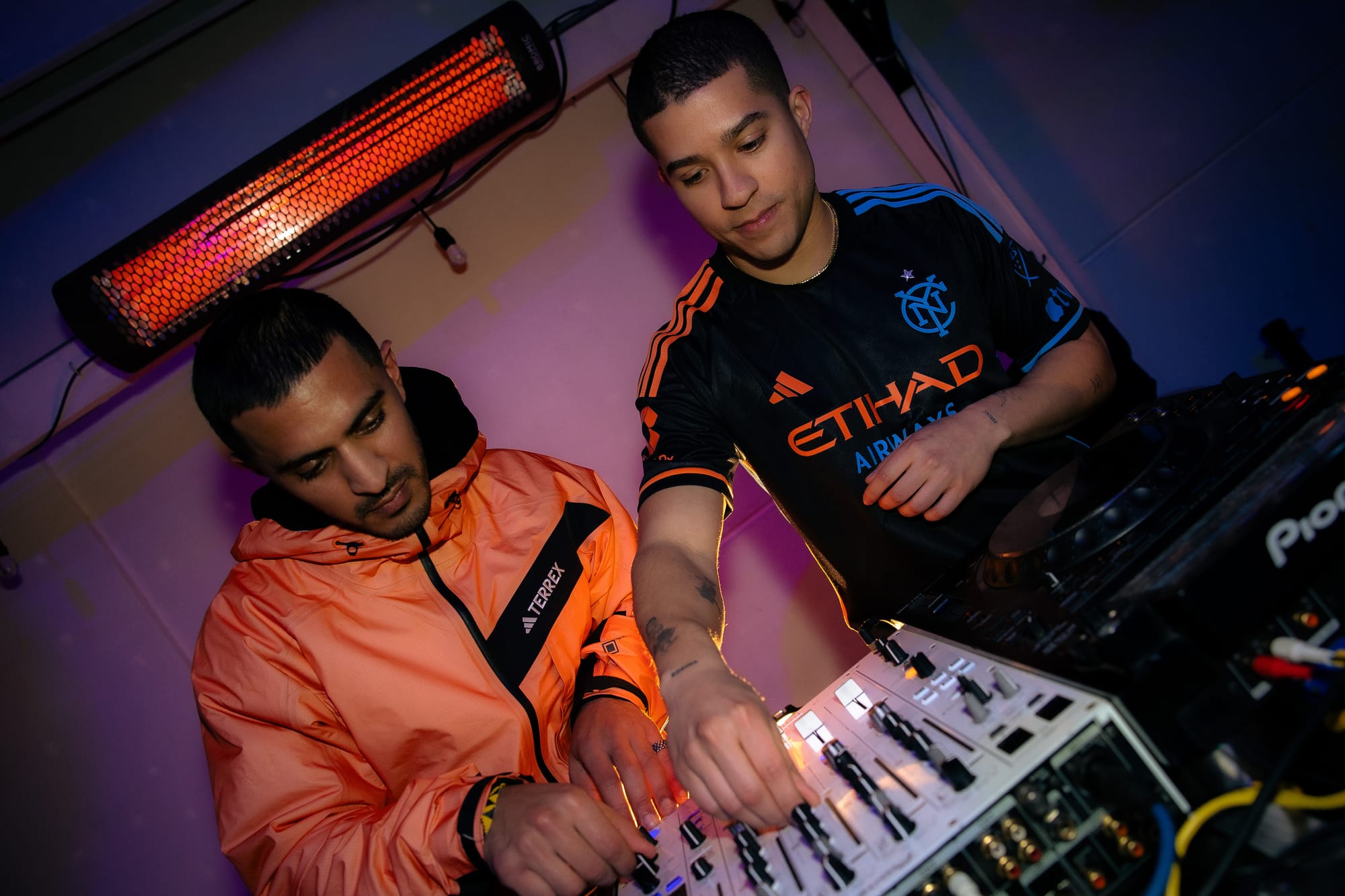
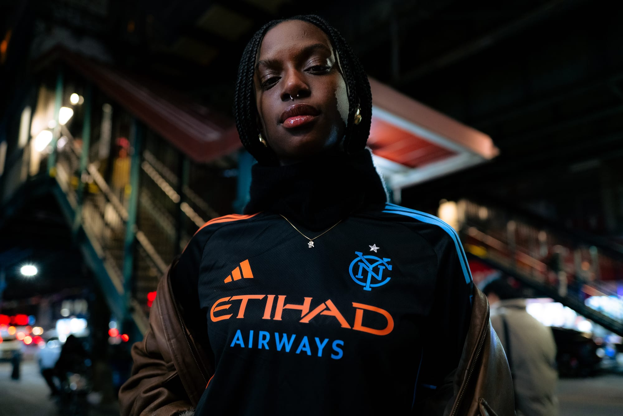
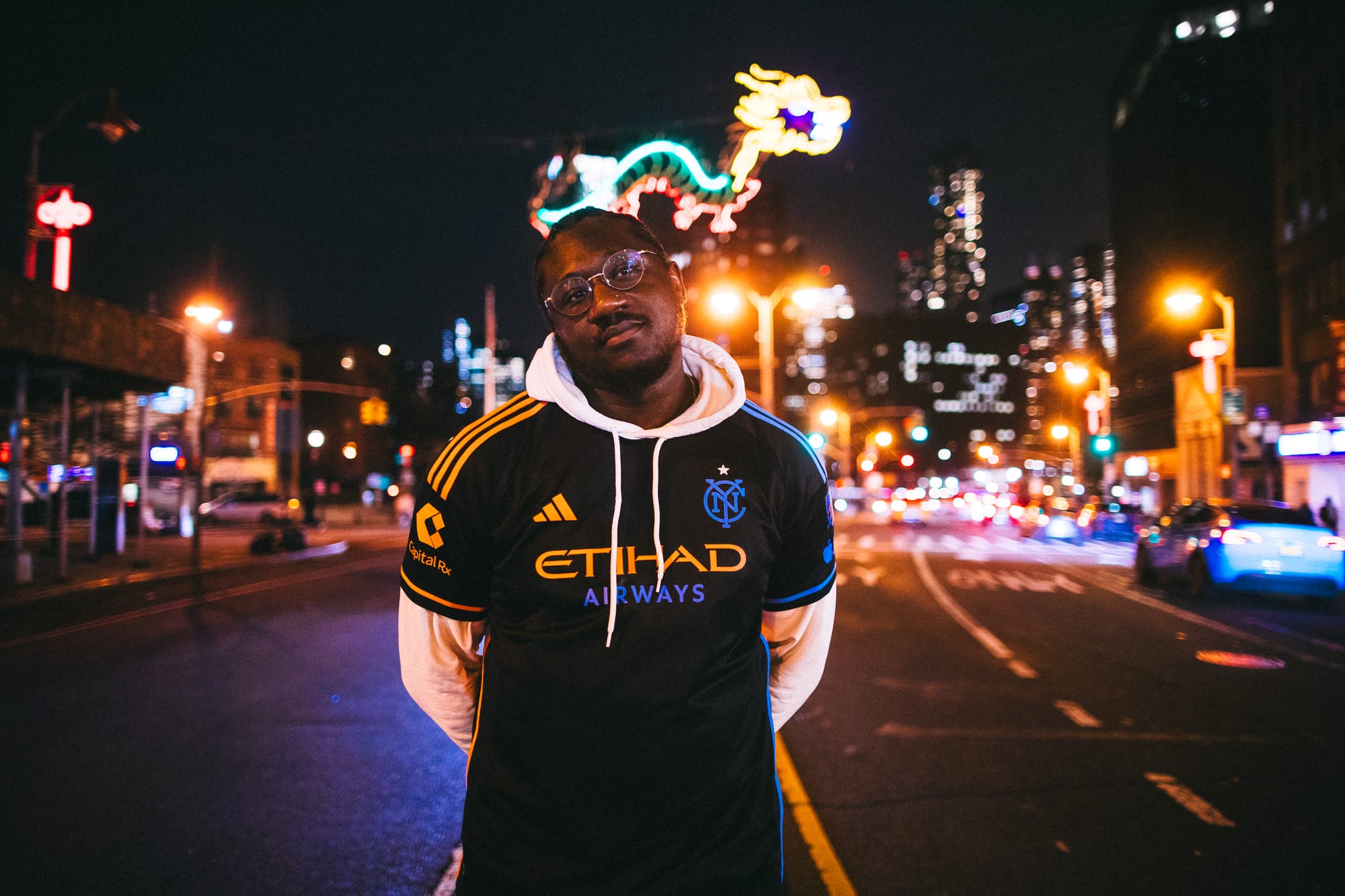
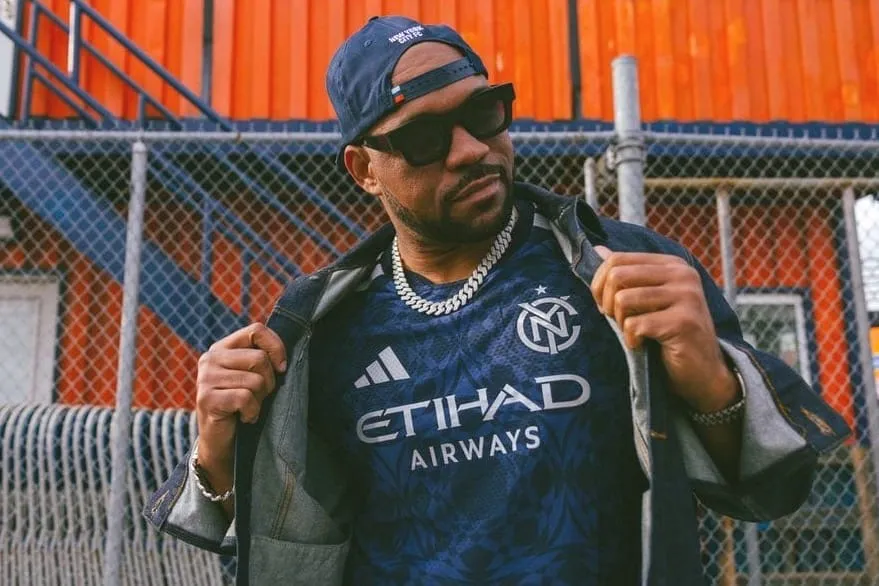
Andrew Leigh: This is such an improvement on the team’s last away shirt, the orange Volt Kit which I thought was an overly-busy visual mess. The 24/7 Kit veers a bit close to “plain black T-shirt” but that monogram badge, the alternating sky blue-and-orange accents—I’m a fan.
John Baney: I love a blackout kit, and have been waiting for this return since 2015. It looks like they did it well too - they kept it simple without it slipping into the boring category. I also love the name. A blackout kit called “24/7” accompanied by a nightlife-inspired drop video taps into a cool vibe. Now we have kits paying homage to our parks, our subway, and our nightlife, and I think that demonstrates a real effort from the club to connect with the city’s culture.
Matthew Mangam: This kit is simple and not overbearing, like the orange Volt Kit. The 24/7 Kit is very similar to the 2015 away kit, but I do not mind that at all. I am a big fan of the 24/7 Kit already.
Raf Noboa y Rivera: This is by far the most “classic” jersey I’ve seen from NYCFC. One thing that plagues MLS is the constant pursuit of novelty. In short: they ain’t got no history. Which is a shame, because American soccer is full of history. I like that this shirt has such a conservative, classical look to it.
HRB: How do you rate this new spin on a black jersey compared to the 2015 Away kit?
MM: Maybe it’s just the nostalgia, but the 24/7 Kit is not as good as the 2015 black away kit. I think this kit is solid and it is one of my personal favorites, but nothing can beat those old-school NYCFC vibes from the days with Kwadwo Poku and Tommy McNamara.
JB: Kind of like Matthew said, it’s tough to separate myself from the nostalgia of the 2015 away shirt. It just feels like such a classic. I think the original away shirt looked a bit more regal, with the fancy collar and the crisp blue piping, whereas this one looks a bit more casual somehow. But maybe that’s a good thing? It could make it more wearable for the average Joe, which is important considering most of us aren’t built like Talles Magno or Thiago Martins.
RNyR: The 2015 shirt is the only New York City jersey in my closet. I think I might make this one the second. That said: I like this one a skosh more than the 2015 jersey because as I said above, it’s a bit more conservative in its design.
AL: The 24/7 Kit is nice, but it can’t compare to the 2015 black NYCFC jersey for me. Yes, design-wise the 2024 version is cleaner and simpler but the overwhelming power of nostalgia means I can’t rate 2024 higher than 2015. Something about watching players like Poku, or Mix Diskerud, or Ned Grabavoy in that black jersey in the inaugural season just hit differently.
HRB: What aspects of the new kit do you love the most? Any parts of the design you would have changed if you were calling the shots at adidas?
RNyR: I love the monogram crest. I think it should be the standard crest on the shirt going forward (the full logo is a bit too fussy for a shirt for me). I’m not so much a fan of the sponsor being two different colors, but that’s just nitpicking to me. The piping is excellent.
JB: If I was calling the shots at Adidas my first order of business would be to cut the price in half so people would actually buy the damn thing, wear it around, and promote the club …but maybe that’s just me? But from a design perspective, I like the alternating colors on either side, I like the stripped-down crest, and I LOVE it when the sponsor buys into the color scheme of a jersey. Plus, the full NYCFC crest on the back of the neck is a nice touch.
AL: I don’t have a problem with the club’s usual badge but I love that the 24/7 Kit uses the sky blue “NYC” monogram instead. My only question would be: Could the kit have included a more overt acknowledgment that 2024 will be NYCFC’s 10th MLS season? NYCFC’s 2015 expansion siblings in Central Florida are going all out to mark the anniversary with their new kit, for example.
MM: I like how the kit has black and orange throughout the design. Although I am not a big fan of the color orange, I do think there is a good amount of orange on the kit but it is not to the point where it is overbearing. I like how one side of the shirt is orange and the other is blue. I’m also glad the NYCFC logo is blue, and the “Etihad” sponsor is orange while the “Airways” part is blue.
HRB: Where do you rank this newest kit in your personal NYCFC jersey pantheon? A favorite, one to forget, somewhere in between?
RNyR: This is, provisionally, my favorite shirt. Much like the LA Galaxy made a sash their thing, I think that New York City should lean into the black as an away shirt color, especially with vibrant accent colors.
JB: Off the bat, it feels like one of my favorites, but I need to see it in action before I make any final judgments. Interested to see what we do with the shorts and socks to tie the whole thing together on the pitch.
AL: Recency bias always has me putting new kits high up in all-time rankings, last year I was blinded by excitement enough to say the Interboro Kit was one of the best NYCFC shirts ever—which, in retrospect, I don’t think is true. That said, the 24/7 Kit is easily one of the three best away shirts the club has had, in contention for No. 1 with the original 2015 black shirt and 2016’s unique, trippy Hypno Kit.
MM: This kit is definitely in the top four for me. My personal favorite is the Gotham Kit from 2020. I also really like the Earth Day kit worn in 2019. Then with the 2015 away kit, that makes room for the 24/7 Kit in my NYCFC jersey tier list.
HRB: Your thoughts on the “NYC” monogram replacing the usual NYCFC club crest, the first time NYCFC have not used their usual badge on a kit?
AL: My personal favorite part of the 24/7 Kit. I hope it is the start of NYCFC getting more creative and flexible with its merch/kit designs. I’m ready for there to be an official Pigeon merch, more use of the monogram, bring it all on. If Seattle Sounders get to lean into their Orca heritage, NYCFC should experiment, too.
MM: I have absolutely no problem with it. I actually think it works better with the simple black design of the kit. The star on top of the logo makes it even better, and I love the design of the NYC monogram on the kit.
JB: I love it.
RNyR: Man, what took them so long? Look, I know it’s standard to call New York City “NYCFC”, but I’ve always stood against this. Using the NYC monogram drives home the point that this is New York City’s team.
HRB: Will you buy and/or wear this new black kit?
AL: Prices for brand-new authentic kits have gotten out of control, so I will save my dollars and continue to occasionally trot out my two copies of the original black 2015 away kit. Perhaps when the discounts arrive for the 24/7 Kit I’ll change my tune and buy it, but for now, admiring from afar only.
MM: I would love to buy this kit, but I will probably wait a little bit until prices go down. If the kit is cheaper than what I expect, then I most likely will, but I am not expecting it to be a reasonable price.
JB: Too expensive. If there’s a big sale, or if I hit a significant financial come-up in the next few months (both seem unlikely), then I’ll consider.
RNyR: Probably. To be honest, as I’ve grown older, I’ve gotten away from buying shirts (because every time I put on a jersey now, I feel like Steve Buscemi saying hello to his fellow kids), so it’s more likely that I’ll cop a hoodie or jacket with the monogram. But I could see myself getting it, especially if I see it at the adidas flagship. I mean, that’s what the income tax refund is for, right? LOL.