
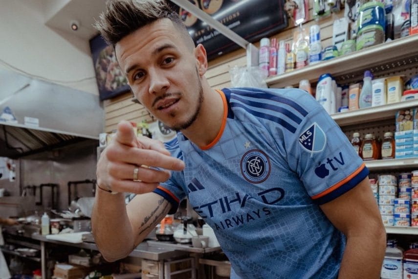
Welcome to the latest edition of the Hudson River Blue Roundtable, in which John Baney, Amanda Collins, Andrew Leigh, Raf Noboa y Rivera, and Derian Trahan, get all hot-takey with the New York City FC’s brand-new Interboro Kit introduced just an hour ago.
Now that the Interboro kit dropped, what’s your unfiltered reaction?
Amanda Collins: HOLY ****.
Andrew Leigh: Easily one of the best kits NYCFC have had to date. It does a good job maintaining that distinctive shade of blue while making things more aesthetically interesting through the incorporation of the subway tile design, the large NYC monogram, and the use of orange as an accent.
Derian Trahan: Off-the-cuff, this is a textured jersey that really speaks to me and visually draws me in, with colored accents that really draw me into the design, especially around the collar.
Raf Noboa y Rivera: It’s…fine. I prefer simple over complicated, but it could’ve been worse.
John Baney: I’m conflicted. I like the idea of the kit but all the shapes and details on the kit might be a bit much for me. The kit is very cool, but also very busy.
What about this kit grabs you? Good, bad, ugly?
AL: It’s clean and uncomplicated while also avoiding the trap some past primary kits have fallen into of just being boring, plain, or overly unoriginal. This is unique and eye-catching without looking busy or too in-your-face a la 2022’s Volt Kit or 2016’s Hypno Kit.
DT: Those hints of orange are used sparingly and effectively.
AC: How bold it is. I finally feel like we have a stand-alone primary kit that differentiates us away from Manchester City.
JB: The crest embedded in the subway tiles is the main grab. Certainly a unique feature.
RNR: Good? The tile design, meant to evoke the NYC subway, is a design element unique to New York City. Also good: It plants a flag and commits, design-wise. It’s definitely a unique look, and given MLS’s unfortunate tendency to go with cookie-cutter designs, that’s a good thing. Bad: The fact it goes from a tile pattern to, well…grid squares? Yeah, not a fan.
What did the design team at adidas do right? What do you wish they had done better?
JB: I think the adidas team deserves credit for creating something that feels unique to New York City. With all the “template” kits floating around MLS over the past seasons, it’s nice to see the club and the city got real individual attention from adidas.
AL: Adidas showed a willingness to get way more creative with the NYCFC primary than they have in the past. Also given that The Outfield reported NYCFC was collaborating closely with the City of New York on an “exclusive uniform,” I was worried we would end up with a Cop Kit that prominently pushed an affiliation with a city agency of Mayor Eric Adams’s choosing. It’s a relief that didn’t come to fruition and we instead have this exciting new subway-inspired design.
RNR: It’s a unique design. I’ll give them that. I wish they’d left out the grid squares on the sleeve and just kept the tile pattern.
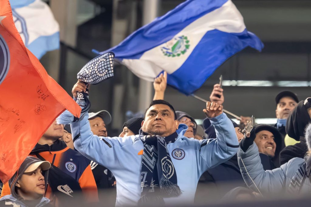
AC: Adidas did the subway tile right. The subways are such a core piece of NYC that makes this city function and I’m happy to see it featured in our kit.
DT: I Like the texture of the jersey and how it is used to really highlight the crest, and the use of color (particularly orange) to really accent the jersey, especially around the crest is such an overall lovely touch. I think the design team at Adidas got it right, just in time to be featured on Apple.
Where does the Interboro kit rank in the history of NYCFC kits?
RNR: I still think the all-time best NYCFC jersey was the 2015 away shirt. This is probably the third- or fourth-best home shirt.
DT: Personally, the Bowie kit will always be my favorite but this is a tight second. I think it certainly sits at the top of the pile for home NYCFC kits.
JB: I think this ranks about mid-table for me in NYCFC’s all-time kit rankings. But, I need to see it on the field before I can say for sure.
AL: Comfortably in the top three all-time. To me, the best kit remains the black 2015 secondary, and no kit since has been able to supplant it. I think the Bronx Blue primary from 2021-2022also deserves lofty status because it was the Platonic ideal of a sky-blue NYCFC jersey, and was also the kit the team wore while raising its first trophies. My first instinct upon seeing the leak was to slot the new 2023 primary right into that third spot, but I think it also has a very strong argument for being either first or second in this ranking. It’s a great-looking shirt.
AC: I rank this kit as one of THE BEST kits we’ve had.
Will you buy it? Wear it?
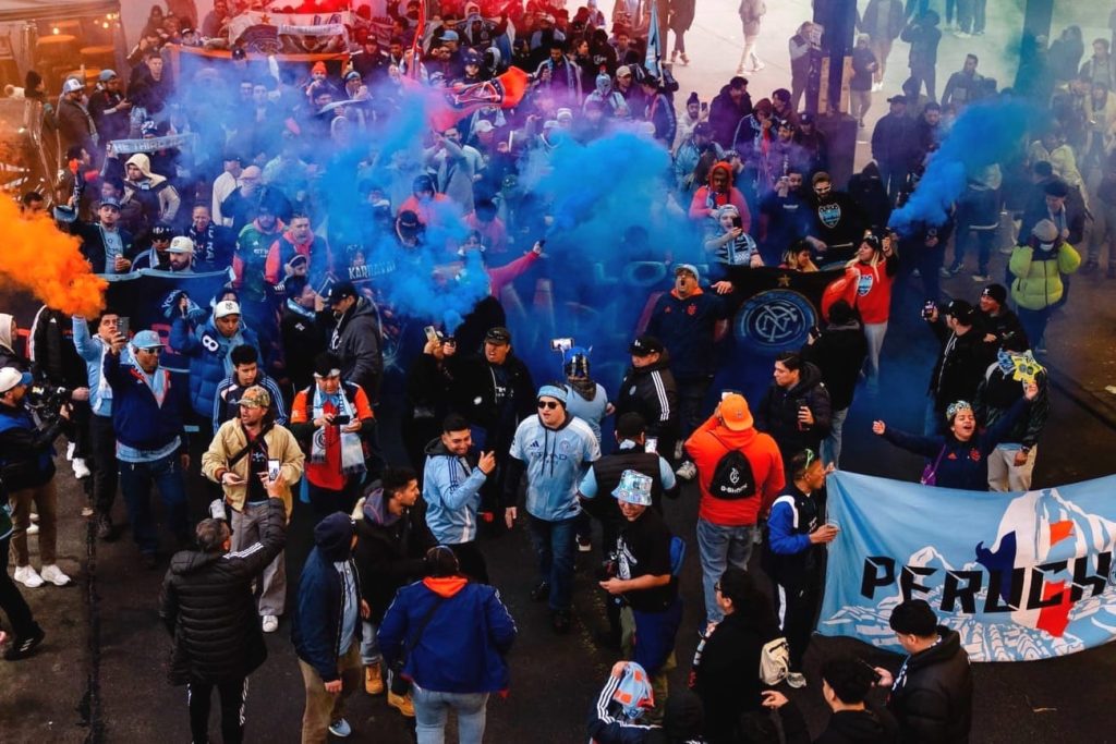
AC: I will buy two of them and yes I will wear them. I’ll probably get Thiago Martins on the back of this year’s kit.
AL: I haven’t bought or worn a kit since the black 2015 alternate. This new kit is the most tempting to date, but I also think I’m pretty close to aging out of my kit-wearing days, if I haven’t already. But once it’s been worn through a full season of matches and eventually goes on sale for a lower price, I very well may have to grab one.
RNR: I won’t, but that’s more because I’ve gotten out of wearing kits. But if they put out a sweatshirt/hoodie/jacket with this design theme, I’d consider it.
JB: I probably won’t buy it because the authentic is listed as $159 on the MLS Fanatics site…so miss me with that. Cut that price in half and I might be in, but even still this is a bit loud for me to just wear around town.
DT: Wear it, for sure. Buy it? When the new job check clears, this may be on the shortlist for a treat-yourself gift.