
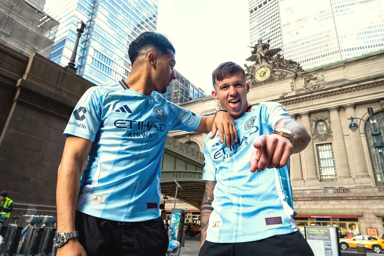
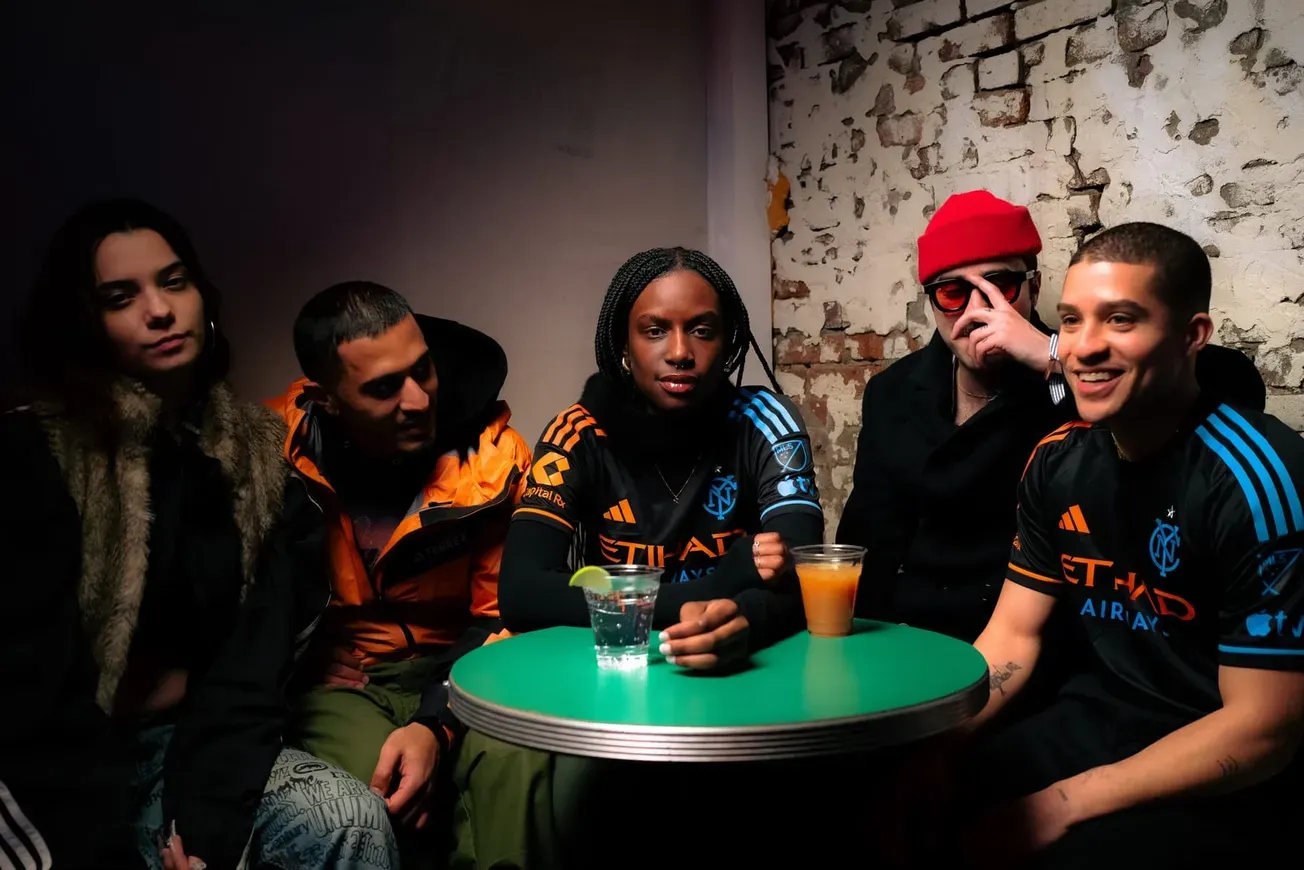
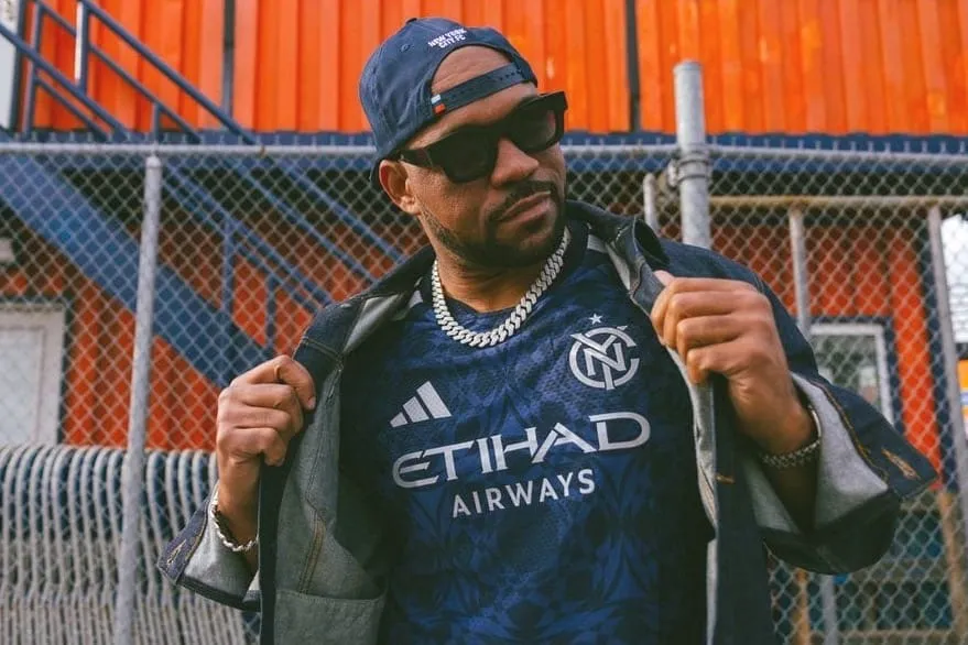
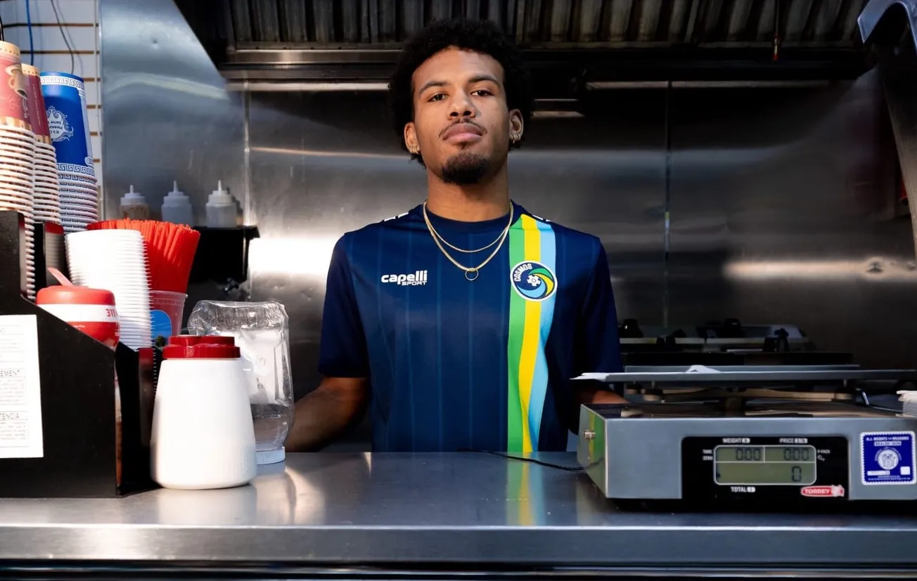
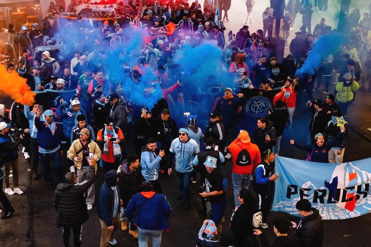
Welcome to the latest edition of the Hudson River Blue Roundtable, in which John Baney, Andrew Leigh, Matthew Mangam, Raf Noboa y Rivera, Mark Radigan, Oliver Strand, and Takashi Williams give you their fuego takes after New York City introduced the Excelsior Kit earlier today.
Hudson River Blue: Let’s start with your gut reaction. What do you think of the Excelsior Kit? Don’t hold back.
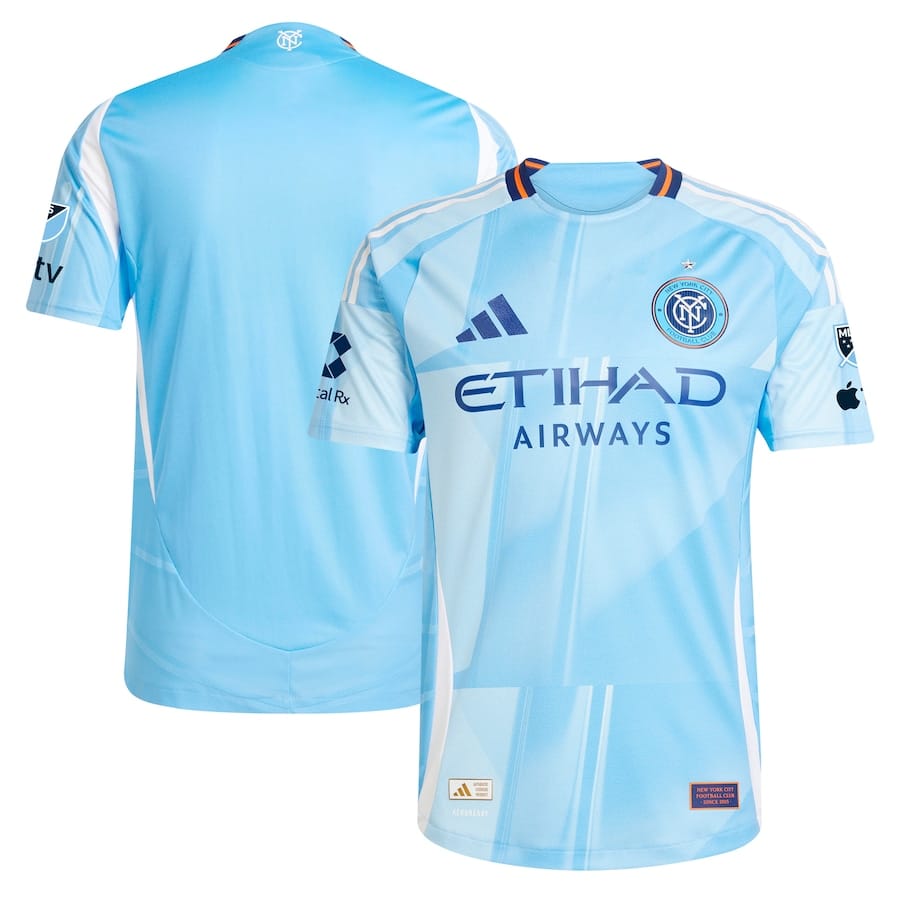
Mark Radigan: I like it. It’s different from what we usually see from adidas MLS kits, and that’s a good thing.
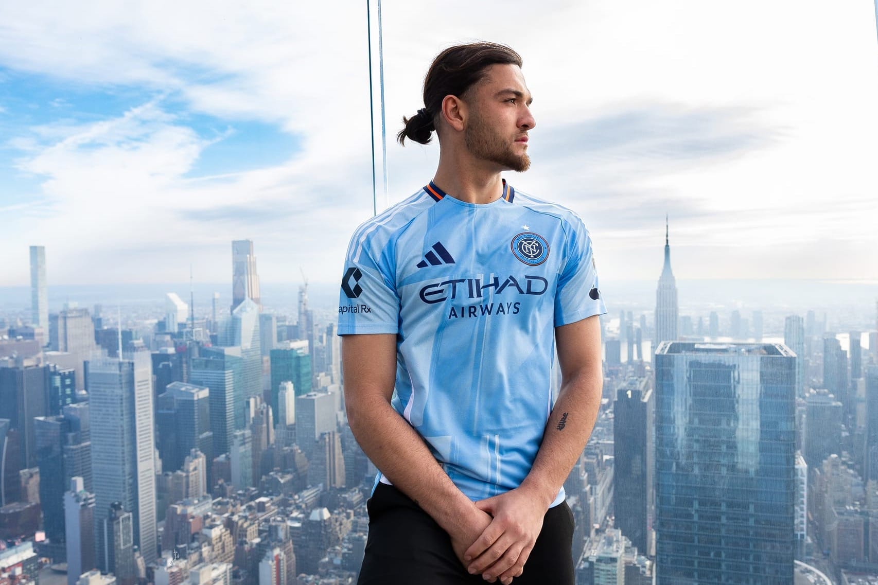
Matthew Mangam: When I first saw the leak, I wasn't a fan of the kit. Now that there's more pictures and it's officially out, I love it. It looks great and I love the light blue tone to it.
John Baney: I like the overall design, but why are we using the old crest again? I know we cited “production time” and that Adidas was already working on this design when the new badge dropped, but surely we could’ve just slapped the new crest on this same kit, right? This feels like breaking up with your partner and then signing a 2-year lease with them. I wish we just hard-launched our new crest once and for all with this one.
Andrew Leigh: The old badge is weird and it looks like the Volt Kit but given the light-blue treatment. The design and stated inspiration are improvements on 2023’s Interboro Kit. I was initially high on the Interboro because of the subway tile-style mosaic pattern, but it ended up looking a little too reptilian when in use. The Excelsior looks like it will hold up better over two seasons.
Raf Noboa y Rivera: I’m with John and Andrew — keeping the old badge when a new badge has now been around for months is bizarre. The geometric design is honestly kind of meh, at least in the pictures I’ve seen. The thing about the truly “classic” MLS shirt designs is that they’re consistent. Think of how the LA Galaxy have had some variation on a sash for over 2 decades. It’s annoying that New York City FC don’t have something similar.
Takashi Williams: Love the takes so far, but I agree with Raf above. The jersey design template just does not do it for me. Love the bright tone of blue that is being used, perhaps even a sky blue which plays on the skyscraper theme. I loved the detail in last year’s jersey by including the essence of subway wall art. But for this year’s edition, it just comes off more like a basic template from Adidas, regardless of the skyscraper details.
Oliver Strand: I like it. A lot, to my surprise.
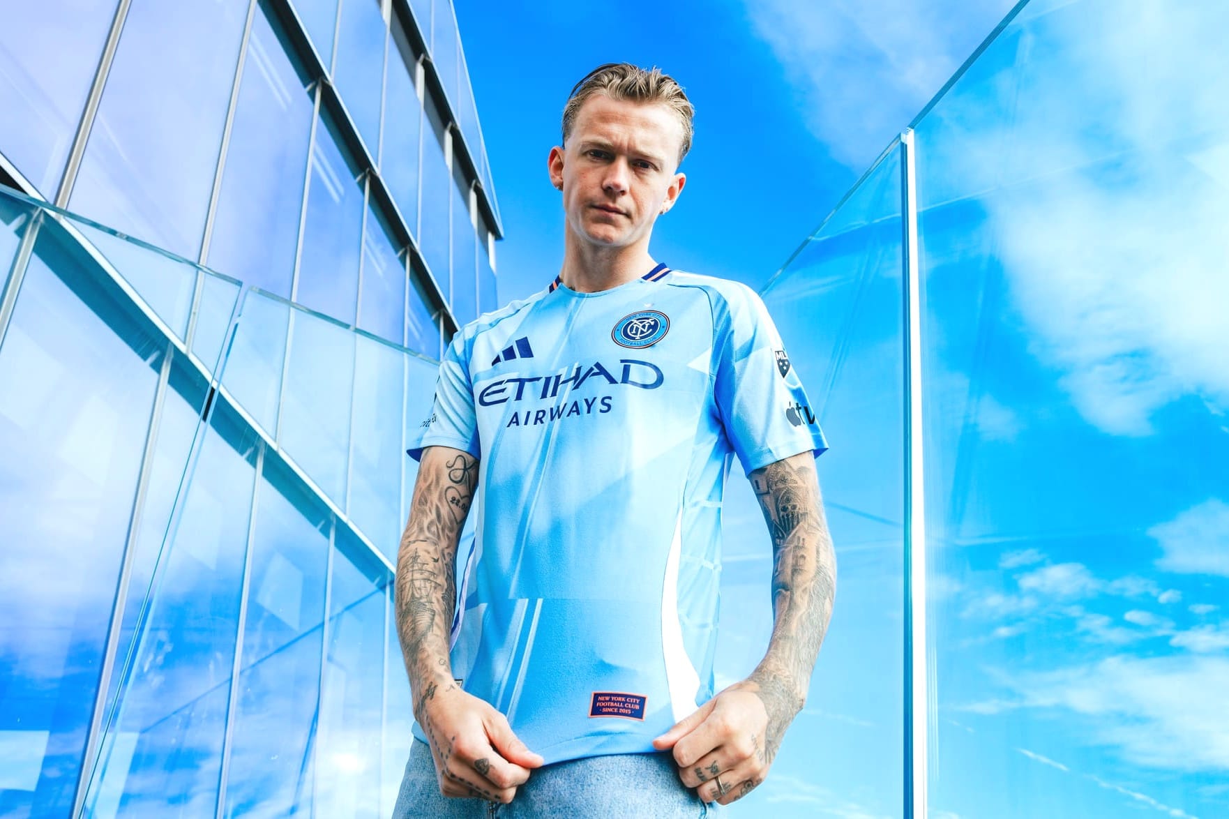
HRB: It’s not quite like any other MLS kit. Do you see New York City skyscrapers in this shirt?
JB: Yes, in a subtle, abstract way. It looks like skyscrapers in the same way Picasso's portraits look like people.
OS: Or maybe it feels German Expressionist, a little “Cabinet of Dr Caligari.”
MR: Honestly, the longer you look at it, the more you start to see the skyscrapers. The gradient really makes the kit stand out.
TW: Yeah, I guess. Not distinctly, but I see their vision.
MM: You have to look really hard to notice the skyscrapers. I hardly notice them, I think adidas could have done a better job with the design of the skyscrapers.
RNyR: Not really? Like John and Oliver said, it’s very subtle and abstract. You could’ve told me that they represent the “speed of New York City” or something similar and I’d believe you. At the end of the day, this is just marketing palaver. I feel like they could’ve drawn inspiration from the Chrysler Building, or the Empire State Building, and this design does nothing to evoke that.
AL: I talked myself into thinking it looked like sunlight being reflected through the windows of one or more of the city’s skyscrapers and I’m sticking with that.
HRB: Does this feel like adidas is advancing design, taking a step ahead? Or does it feel out of touch?
RNyR: Yeah, it’s an adidas template, but at least the geometric shapes zhuzh it up a skosh? Ultimately, though, it’s not really memorable, and it feels like a bunch of the new MLS kits this year are on that pastel/pale color kick.
AL: The design works with the concept and it looks unique-ish while still fitting in their template, so I’d consider it a success by adidas standards. It does read “skyline” and it is better than some of the even more basic, more boring templated adidas jerseys you see around MLS.
MR: It seems to me that adidas has finally heard the cries for more creative designs. The templates given to MLS teams can be quite plain and boring, but this gradient pattern shakes it up a bit. I think it’s a step in the right direction, and I’m looking forward to seeing El Clinico bagging goals in it.
MM: I think adidas has upped its the game with the MLS kits this season overall, this one included. The kit isn't anything above and beyond, but adidas did just enough to make it feel fresh and unique.
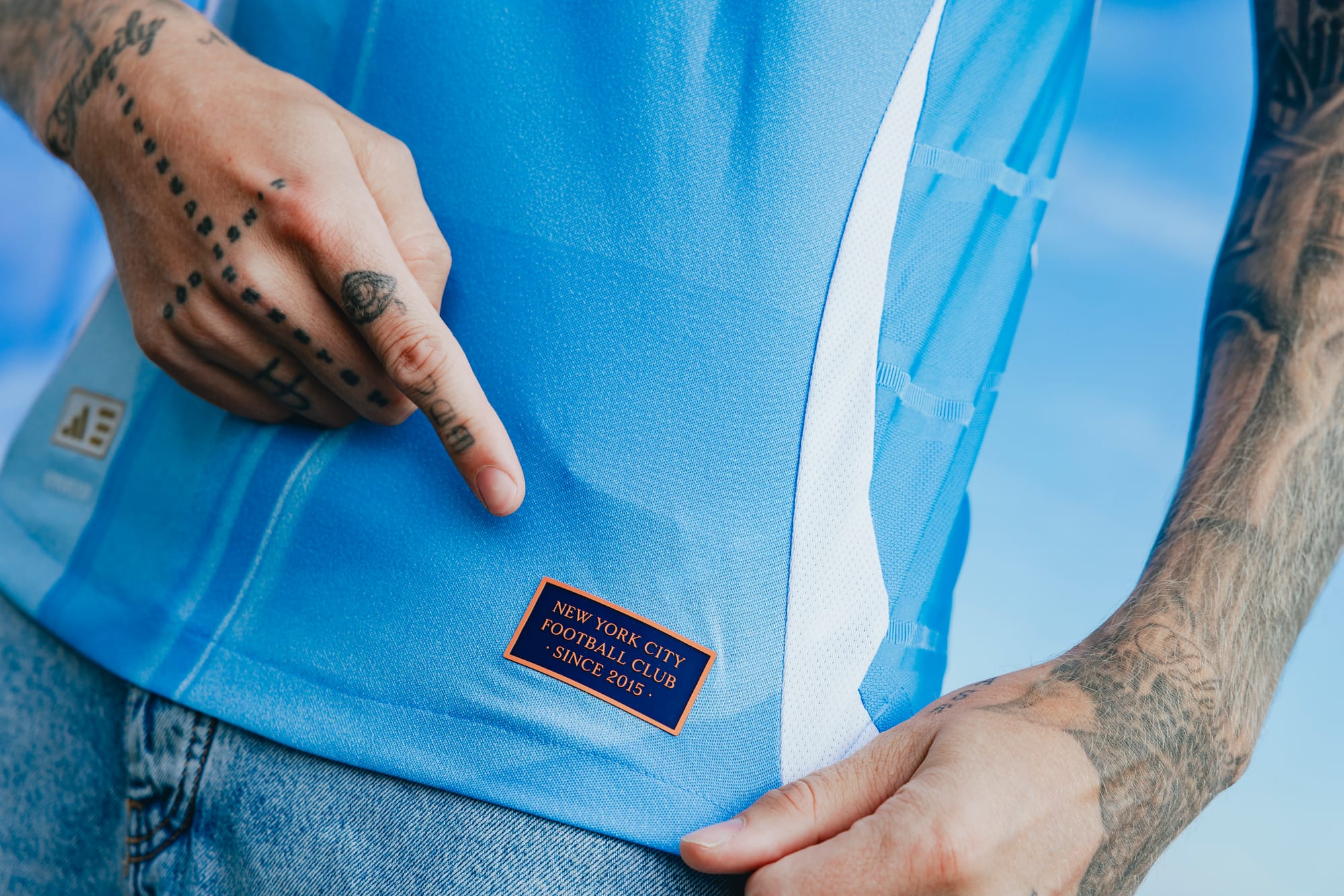
JB: It looks like the same adidas template that Manchester United and Fulham are sporting right now with the curved piping up and down the obliques. That said, I actually like this look far more than United or Fulham’s rendition. The “skyscraper” inlay helps give it a bit of individuality, and I really like the orange piping in the collar. But it’s hard to be truly innovative when every kit comes from a template.
TW: Seconding JB here. Not enough in the design to make me think it was not a basic template they chose from.
HRB: How do you compare it to the now-retired Interboro Kit?
OS: I have no problem saying goodbye to the Interboro Kit. Introducing it at the start of the 2023 season did it no favors — so many painful memories of games played in that shirt.
JB: I agree with Oliver here — that Interboro Kit was cursed. Kits become cult classics for one of two reasons: The design itself, or the legendary performances in which it was worn. That kit was a miss on both fronts.
RNyR: I felt like the Interboro kit was…fine? I had the same reaction that Andrew had above – it looked like a snakeskin pattern. At least it was distinctive! I’d much rather miss in that direction than not.
AL: I grew tired of the Interboro Kit pretty quickly after being wowed by it initially and thinking it was one of the team’s better home kits. I think I might have the opposite experience with the Excelsior — I was merely whelmed when seeing the first leak, but my opinion of it has improved with the official release.
MM: I had the same thoughts on the Interboro Kit when it first came out ahead of the 2023 season — I felt like adidas was trying to do too much and it made the kit feel overbearing. I’ve actually grown to like the Interboro, even buying one myself last season. I hope this kit has the same effect on me.
HRB: This is the sixth home kit in club history. Where do you rank it overall?
MM: My number one is the Bronx Blue kit from 2021-2022. You can put my ranking for this NYCFC home kit right in the middle. It's ahead of the 2019-2020 kit and the Interboro kit, but behind the Bronx Blue, 2015 OG kit and 2017.
OS: Seconding the Bronx Blue. Call me old-fashioned, but I like the classic colors and detailing. But this Excelsior could be third, even second?
JB: Glad we all agree that Bronx Blue is king. I think this could be my second favorite though if it looks good out on the field.
RNyR: Bronx Blue, and it’s not even close. The thick collar and cuffs are an excellent detail choice, it’s a classic, “clean” design, and it’s the shirt that New York City FC won its first title in. Unlike Matthew, I liked the 2019 shirt with the Hechter stripe, like PSG, because it introduced a unique element that only a couple of MLS teams – San Jose and New England – have toyed with. That would be my second choice. Then the 2017 with dark blue trim, the Interboro, this one for now, and the 2015.
AL: The Bronx Blue one was sharp and I can’t quibble with its #1 ranking, but I’m siding with Raf that the 2019 Home shirt is slept on. The passing years make it look like one of their more unique and eye-catching home kits. The home shirts all tend to blend together, even the Bronx Blue isn’t that much of a departure from the very first inaugural home jersey from 2015. This 2025 edition is ahead of 2017 and 2023 for me, but behind 2021 and 2019, and it’s a push with the 2015 OG.
HRB: Would you buy it?
MR: I’d totally buy it.
MM: Yes, I will buy this kit.
JB: I’ll be rolling over in my grave before I give Fanatics another dime. But ask me again next week after payday hits.
TW: I’m a big jersey guy and love collecting, but would much rather find an older NYCFC jersey for a fraction of the price before dropping all that bread for this year’s edition.
OS: I’m not sure that men of my age should wear a soccer jersey, ever. But I have a feeling that one is in my son’s near future.
RNyR: I’m with Oliver; once you hit a certain age, you gotta tap out of the jersey game. At this point, I’m a sweatshirt and hoodie guy. I have the 2015 away shirt. If I find the Bronx Blue shirt, I might cop that. So that’s a no from me.
AL: I am in “old man yells at clouds” mode about the jersey prices. The kits are too dang expensive! I will not be purchasing yes because I can’t try squeezing into a sleek piece of authentic athletic apparel in this shape or at this age, but also because I don’t want to spend $149, plus shipping and taxes, on a shirt.
HRB: Choose one, the Excelsior Kit or the 24/7 Kit?
MR: 24/7 Kit without question. The crest, the accents on the sleeves. Simple, yet perfect execution.
TW: 24/7 All day.
MM: The 24/7 Kit is probably my favorite NYCFC kit. Ever since I bought it at halftime of NYCFC’s 2-0 win over DC United at Citi Field last season, I’ve worn it a ton. It became a regular part of my outfits that whole summer and it definitely will again this spring and summer.
JB: From the design to the drop video, the 24/7 kit remains my all-time favorite
RNyR: 24/7 kit is fantastic, for the reasons Mark mentioned. The only change I’d make is a higher, chunkier collar, like the Bronx Blue kit, but that’s a “me” thing.
AL: I like the 24/7 Kit but it also is a slight imposter — the black 2015 away kit is the real kit champion, for my money still is NYCFC’s best-ever jersey. I own an authentic 2015 away with “MIX – 10” on the back, and I can’t usurp it with the 24/7 Kit, so I’m choosing the Excelsior.
HRB: Now for the speed round. Five words or less: What’s your take?
JB: I think I like it?
MR: It’s different. I like it.
MM: Unique. I'm a fan already.
TW: Not unique, but a jersey.
AL: Volt Kit but sky blue.
RNyR: That’s a no from me.
OS: It’ll look right on gameday.