
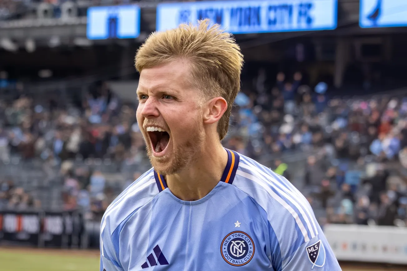
Yesterday, New York City FC announced that the club's badge will be updated for the first time since it was introduced in 2014. The basic form and color palette remain the same, but the type is heavier and more graphic, while the orange and dark blue borders are now more pronounced. It's just like it was before, only different.
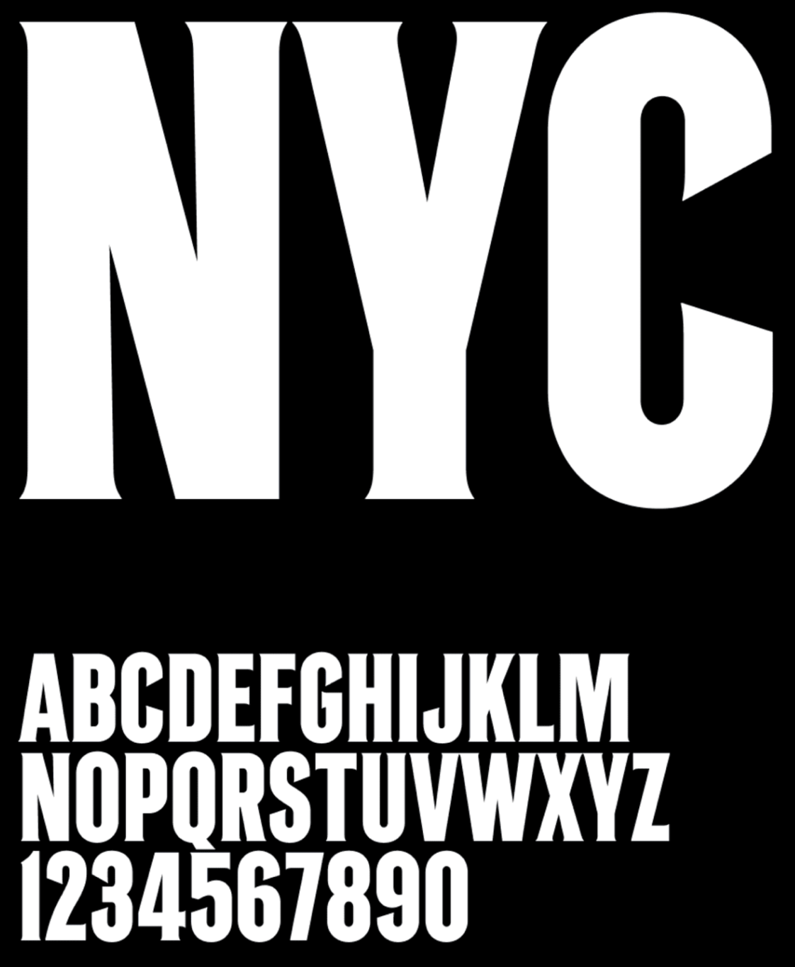
It's the latest phase in the visual refresh revealed by the club back in March, when when New York City introduced new colorways (Excelsior Blue, Neon Yellow, Roosevelt Violet, Copper Green), and new iconography. Most importantly, it was the debut of a custom type commissioned by the club from Tobias Frere-Jones. In the world of design, that's a flex.
And that custom font is now on the New York City badge. But before we get into what that means, let's hop into the time machine called the internet and look at the logos of Major League Soccer clubs in 2014, when NYCFC revealed their original crest.
2014: Fussy, cartoonish
There were just 19 teams back then, and the insignias came in a variety of styles, many with complex shading and intricate details. There was the firefighter badge of Chicago Fire, the crayon flag of New England Revolution, the album cover faces of Columbus Crew.
Almost all of the badges took the shield as the basic form, 13 in all. Only three were round. Of those, two pushed outside the borders of the circle, messing with geometry's most perfect shape: Chivas USA planted a crested shield at the top of their circle, while the Portland Timbers axe and stylized mountains pushed past the perimeter in five different places. Just one was a pure circle, although inside the center there was, confusingly, a shield: Shoutout to Philadelphia Union.
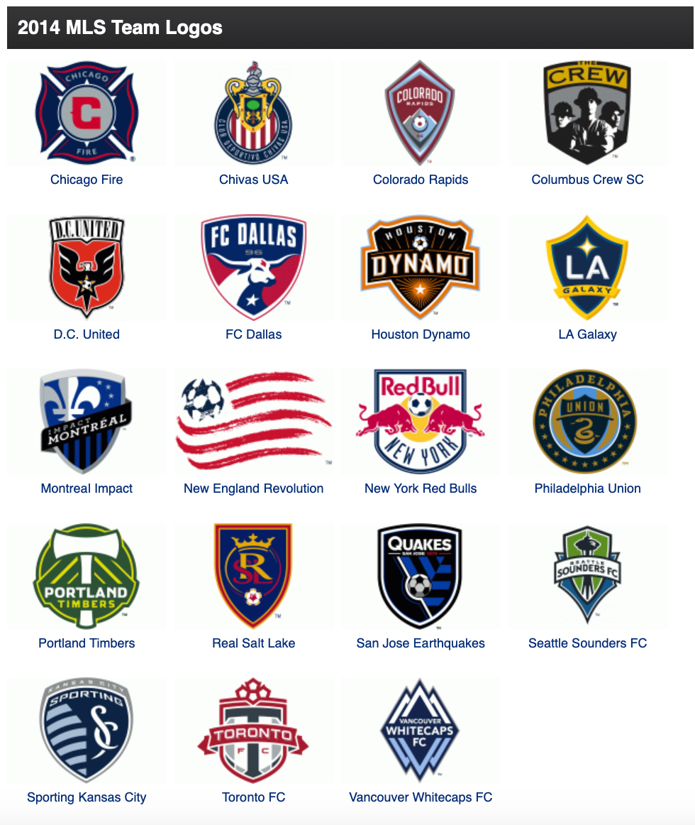
This was the visual landscape into which New York City stepped.
The badge introduced by the club on March 20, 2014, was the second one to keep the essential shape of the circle, and the only one in the league not to add something cartoonish: There was no bull, no snake, no soccer ball with stars for panels. Instead, New York City's crest was just lettering and colors. Let the others have mountains and eagles and ribbon banners that pretended to wrap around the edges — all NYCFC needed was typography.
The badge produced by Matthew Wolff Design.1 was clean and elegant, an instant classic, as they say. It was new but timeless, and it came to set the standard for the league.
2024: Clean, bold
Jump to the present day, when the iconography in MLS is drastically different. The shield is still the most popular basic form, with 16 of the league's 29 teams using that shape in one way or another. (Or 20, if you include having-it-both-ways Inter Miami, CF Montréal, and Philadelphia.) But now there are nine circles, and eight of those are pure geometric forms.
Three of those owe much to New York City's badge. Charlotte FC, Miami, and New England all follow NYCFC's template to one degree or another. But more than that, badges across the league swapped out the fussy drawings of the previous decade for iconography that is more direct and graphic, such as Seattle Sounders' cleaned-up Space Needle, or Houston Dynamo's interlocking H and D. Teams such as Austin FC, FC Cincinnati, and Minnesota United use bold emblems that could be made from woodblock prints.
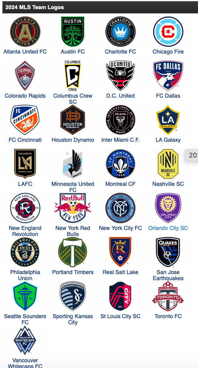
New England traded out the crayon swoops for something that looks like the coaster of an upscale brewpub, while Chicago and Portland entirely did away with words. Suddenly, NYCFC's badge didn't stand out as much as it did before.
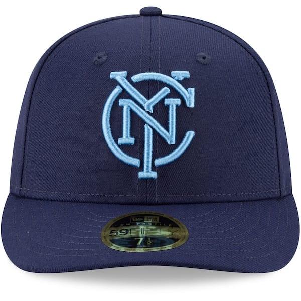
The club addressed this in somewhat 2022, when they introduced a slimmed-down monogram as a secondary crest. It's the same lettering as the original badge, but liberated from the circle. The monogram appeared on hats and warm-up gear. It even replaced the badge on the 24/7 Kit introduced at the start of this season.
But that was just a temporary fix. Besides, the monogram will change as well.
Chekov's gun
The playwright Anton Chekov once said, "One must never place a loaded rifle on the stage if it isn't going to go off. It's wrong to make promises you don't mean to keep." The dramatic principle now known as Chekov's gun is fairly simple: Once you bring it up, you better use it.
In this case, the custom font from Frere-Jones Type is the gun. After the club introduced it to the public, it was just a matter of time before they were going to pull the trigger.
Courtesy newyorkcityfc.com
So what, exactly, is different about the new badge? As the video above shows, the fonts of the "NYC" monogram and the "New York City Football Club" lettering are now the same. The type is heavier, with serifs that are less pronounced than what was on the monogram before. The negative space between "New York City" and "Football Club" is reduced, which makes the words easier to see, while the monogram takes up more real estate in the middle.
The thin white ring around the monogram is gone, and the orange ring on the outside is a touch thicker. The monogram was the star of the show before, while "New York City Football Club" played a supporting role. Now the two share top billing.
The overall effect is a badge that feels solid and weighty. It's less Real Madrid, more subway token.
Reactions on the interwebs have been mixed. Some voice their support, and the new look. Others, not so much.
But there's no looking back. New York City aren't likely going to pull a Montéal, which introduced a new badge in 2021, and then announced plans to replace it the following year. As the official statement from New York City puts it, "Fans can expect to start seeing the updated badge in stadium-related imagery, with a larger rollout planned for the 2025 season."
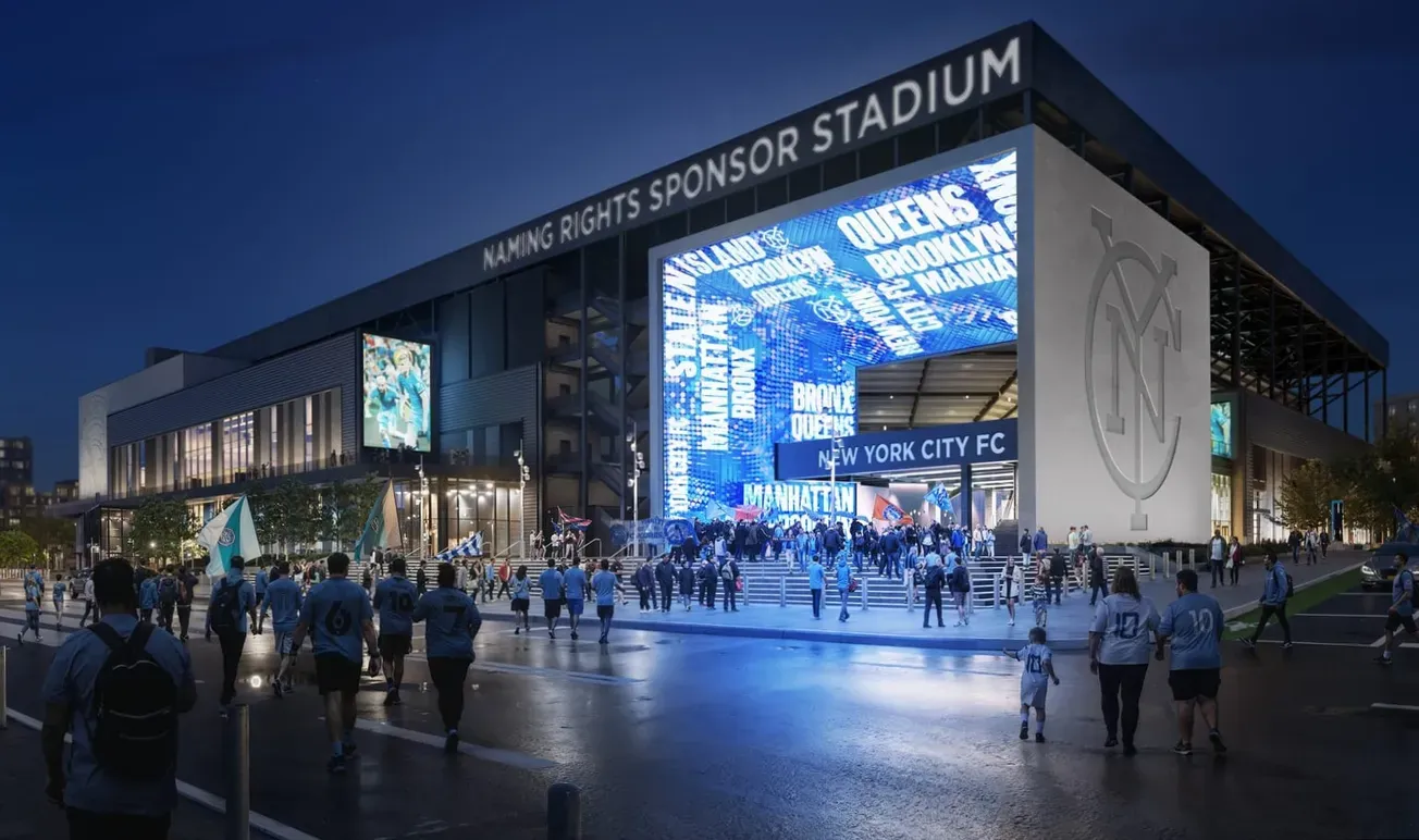
Presumably, that means the new type will be on The Cube, the towering stadium entrance described by HOK architects as an "experiential installation" that will feature a 11,000-square-foot of LED lights capable of projecting videos, photos, and graphics. According to the renderings, the most prominent exterior wall will have an NYC monogram that's seven stories tall.
1 Matthew Wolff Design went on to create badges for LAFC, Chicago Fire, Gotham FC, San Diego Wave, Oakland Roots, Union Omaha, and others.

